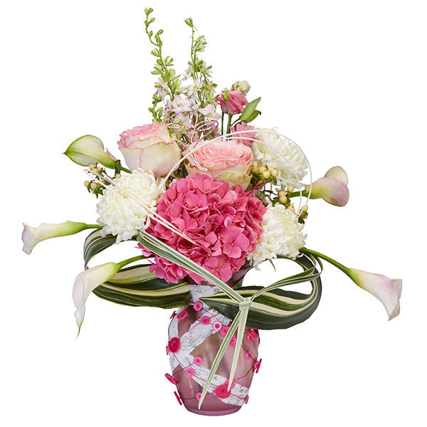
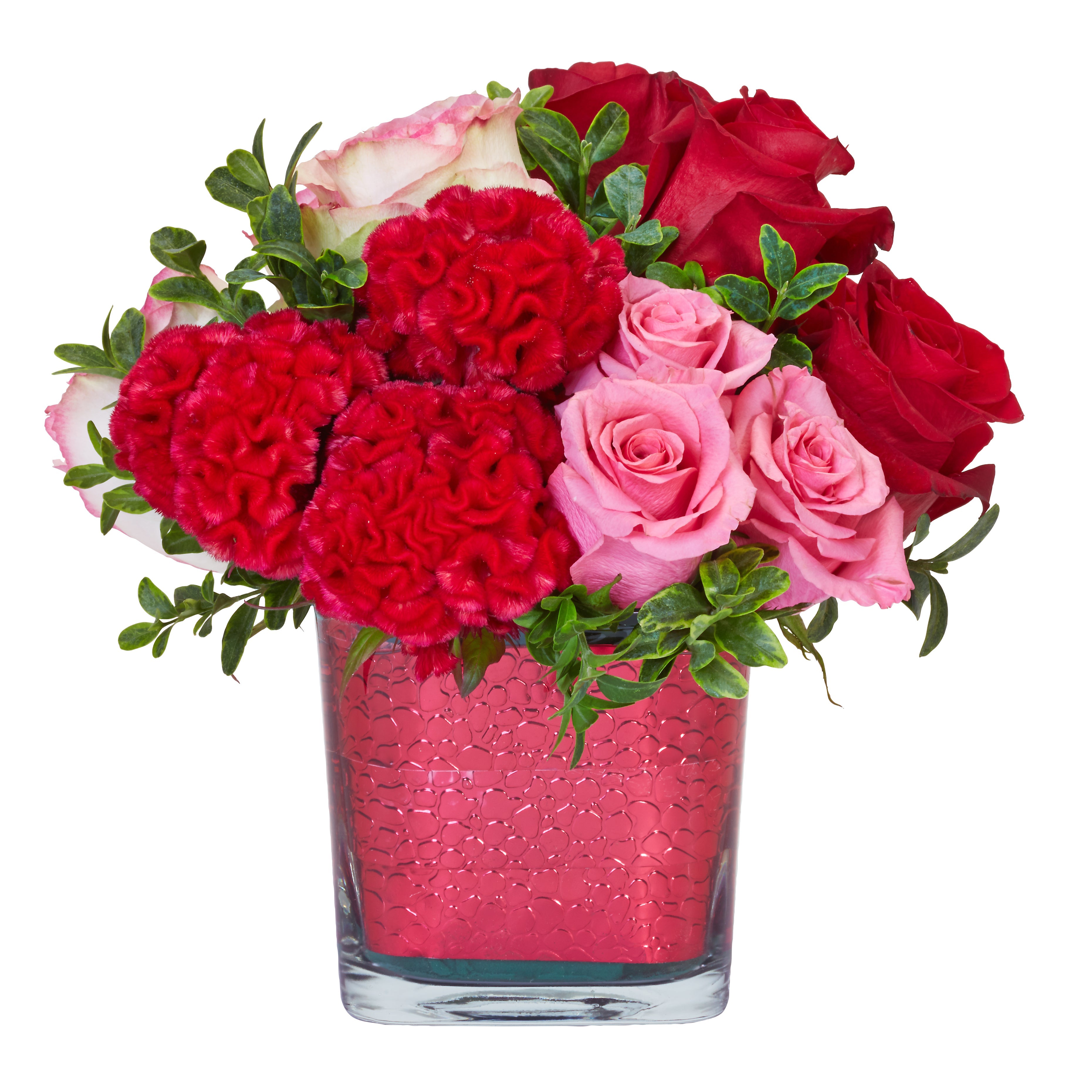
 Valentine's Day floral design with Pantone 2016 Rose Quartz pink. Click image for recipe.
Inspired by the ethereal pinks and restful blues that paint the sky of a beautiful sunset? If so, Pantone’s 2016 choice of two peaceful colors, presented as one look—Rose Quartz (pink) and Serenity (blue)—may fuel your passion for tranquil beauty.
The influence of these colors can already be seen in products across the marketplace. How can these serene colors of Pantone's new color palette in floral arrangements be used in the busy and modern lives of our customers?
Lifestyle and floral design colors
Color can be psychologically soothing. These peaceful pastels, visually calming and de-stressing color choices are found prominently in this year’s fashion, health and wellness and home accessory product lines. Floral designers can incorporate flowers and floral accessories in these color harmonies.
Perhaps indicative of the blurring gender lines of today’s society, we will likely see more consumer goods coming forward in these hues that were once considered just for infant boys and girls.
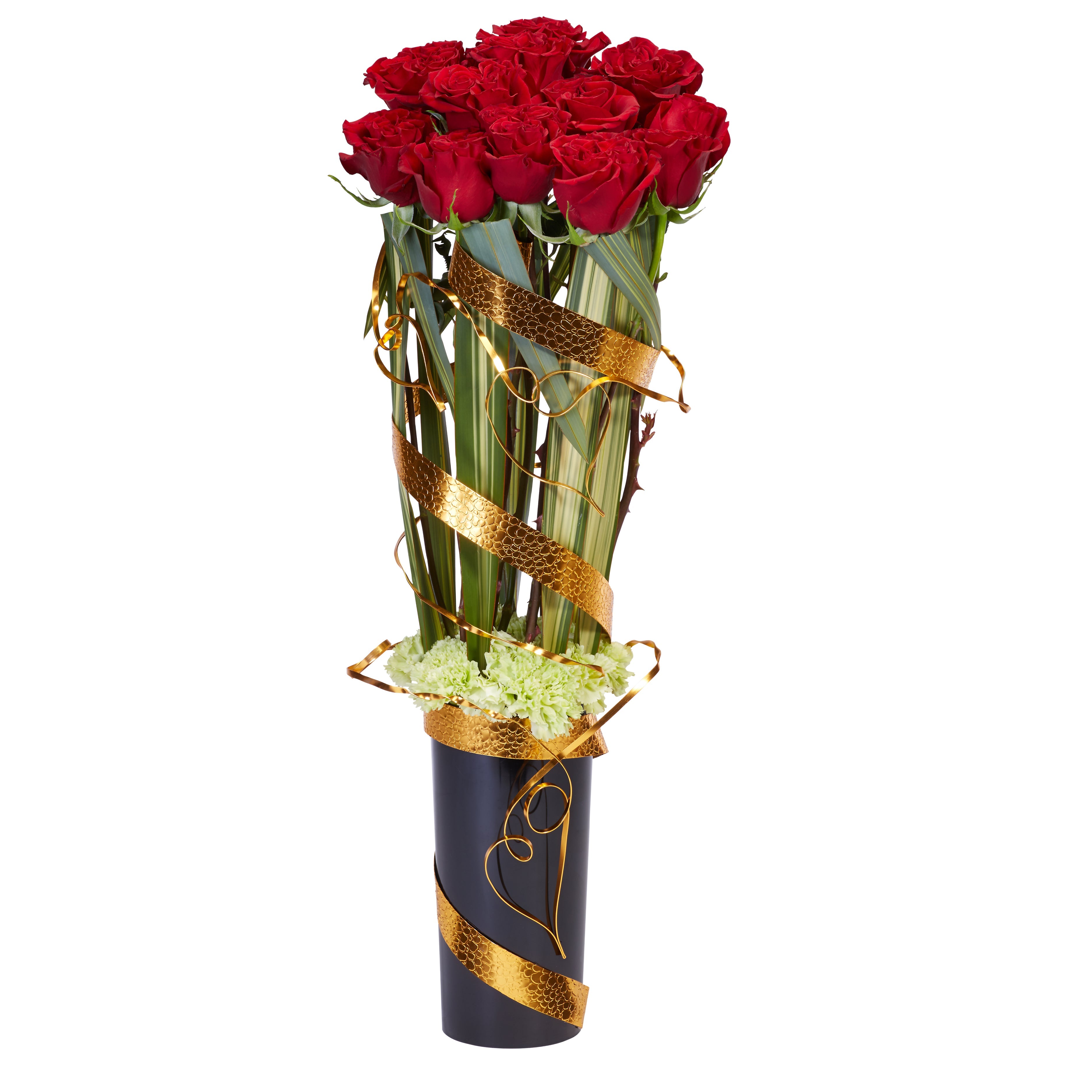
For example, Smithers-Oasis has a long list of products in these trendy new colors that can be used to enhance flowers used for wedding, prom, sympathy or everyday designs, including
Decorative Wire,
ECOssentials containers,
Raw Muslin,
Colour Regen Floral Spray Color and
Midollino Sticks. Check out our Pinterest board with lots of creative ideas for using these colors:
Pantone 2016 floral design board.
Fashion and floral design
The fashion industry is embracing the on-trend theme of escapism this year. It’s enlisting the help of punchy pastels to help buyers feel revived by wearing bold colors. Rose Quartz and Serenity are tranquil by comparison.

Look for the creative fusion of these colors in clothing, jewelry, and accessories. Pairing these subdued soft pink and blue tones in plaids, patterns or floral prints helps to create balance with the more intense and playful tones in the rest of the 2016 palette.
This trend will influence some color choices for wedding and prom attire as well. Suggest floral accessories to your customers that blend these diverse ‘light and bright’ color combinations for a trendy new look.
Home accessories
When life gets crazy, we retreat to the home. Tired of worldly turmoil, we want to surround ourselves with things that feel fresh and reassuring again.
Choosing housewares such as candles, vases, dishes, linens and such in these soft tones feels welcoming and comfortable. This adds to our sense of security and wellbeing. Show your customers how to incorporate these household items with flowers. Create vignettes of household items mixed with fresh or faux flowers to illustrate this mix of color.
Opposites attract to create balance. Ying and Yang. Calm and chaos. Warm and cool. Masculine and feminine. Rose Quartz and Serenity. To create visual balance with these colors choose one hue as the primary color and use the other color as an accent, blending the two as Pantone has done.
Feeling nostalgic?
Along with the feeling of calm and balance, these serene colors remind us of less hectic days. Feel like you are reliving the 80’s when looking at this color palette? Well … maybe. Remember with trends ‘everything old is new again’ eventually. Even mauve was a hit … back in the day.
‘How can you use Rose Quartz and Serenity in your floral designs?’

Leave a comment
This site is protected by hCaptcha and the hCaptcha Privacy Policy and Terms of Service apply.